


Thursday
May202010
Final Touches on the entryway, or not....
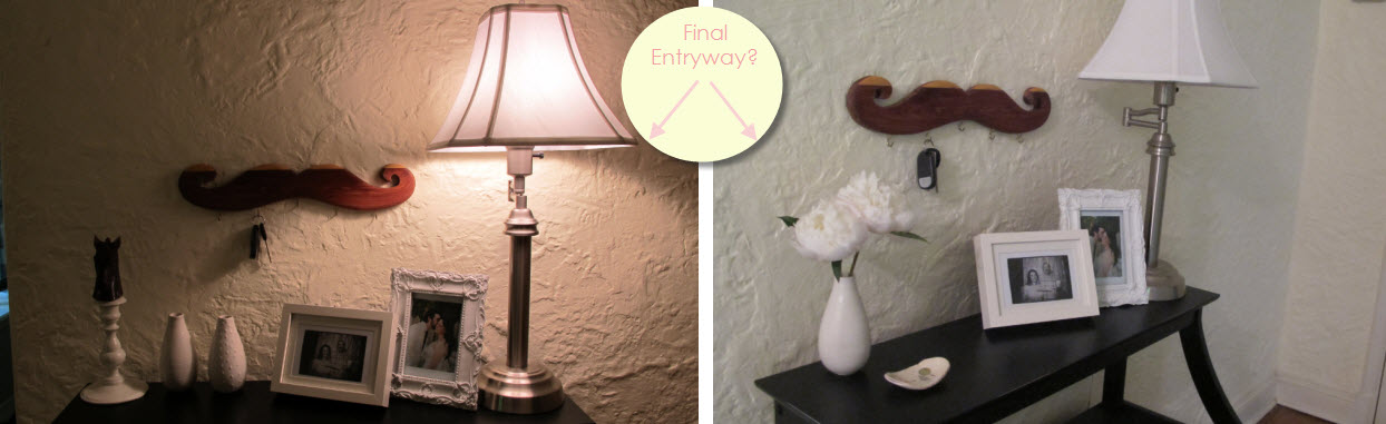
Horse or flowers? To moustache or not to moustache? We thought we figured it out, but now we need a vote! While cleaning up I peeked out the window to see how the plants were doing and much to my surprise these amazing bursts or white and pink peonies were hanging out. I immediately snipped some and now I want to show them off. Flowers + horse do not look good together. Thoughts on how to make this space look more coordinated?
 Joey and Lana Make a House a Home
Reader Comments (8)
Hi,
I like the second table dislplay. The first had to much. Instead of the "mustache" go with a picture to add more warmth and color to the area. Like your comparisons. Good luck!
thanks unique! we have no idea what to do with the mustache! we love it, but it just doesn't "fit" anywhere.
you must mean final touches....????
I like the second picture, too. I think the mustach would look cute somewhere less formal--say, where you hang the dog leashes? Or in whimsical bathroom-- you could use it on which to hang hand towels for guests.
Touches! Yes! oops. Thanks BeachGirl!
Yersinia - You just gave me the best idea! It's going in the mud room to hold the dog leashes! Thanks!!!!
Have you thought about a "chunkier" lamp? Something with a bigger base and maybe a pop of color. MIght help the arrangement look more balanced.
I like the second table. I'd move the mustache to another area that is more informal. I think a picture with lots of color would look best on the wall. Your walls are white and so is everything on the table except the lamp. I would also suggest a different lamp. If you get a picture with lots of color you could go with a lamp that's acrylic or glass and it won't distract you from the picture or your pictures. I think the white shade blends in too much with the walls. It would look good with a black shade. Remember the entry is the first thing people see when they enter your home. Make a statement there!
Oh, the flowers are gorgeous! They must be displayed prominently.
Prolly just me but the horse head is a bit unsettling - shades of The Godfather!