Related Posts Plugin for WordPress, Blogger...

                   Follow Me on Pinterest


photo cards


OpenSky

Freckled Nest - Design by Kelly Ann

Home & Garden Blogs
BLOG DIRECTORY
Online Marketing
Home Improvement Blogs - BlogCatalog Blog Directory

Entries in bedroom (16)

Friday
Aug202010

a little bit of history

We have been thinking about how quickly time goes, and how we had forgotten "city life". It's amazing how homeowner ship brings along so many new challenges that apartment dwelling simply doesn't have. From keeping the lawn alive, to not having a super to call in a pinch, the reality is equally overwhelming and rewarding. We wanted to share with you where we lived through the years (almost SIX in total now!), before we landed in the 'burbs and and moved to what we now permanently call home.

 This was a brand new modern apartment with a "backyard" spanning three feet of cement and fence. It’s crazy to look at now and notice, but we had this modern palate, and we were forcing the homey, cozy, vintage vibe into the space. I don’t think we pulled it off very well. This studio had a cut out for a bedroom and super high ceilings. It was a fun place to live and great for company - but we grew out of it very quickly, and move to the place below.


This is where we lived for a few years before we bought our home. It was a studio in Brooklyn we turned into a two bedroom with the tiniest little bedrooms you have ever seen. The building was an old ballroom, and we enjoyed the neighborhood very much. It had a cozy vibe to it, and we made it into our home. We made curtains, and art and tried to customize it as much as we could to make it our own. When we realized there was nothing more to do to the space, we felt we grew out of this place as well and “moved on “.

So there is a little peek of the path we lived before we settled down and committed to buying a house. I think no matter where you live, you can make it a home, and there are pro's and con's to every situation. We would love to know from Homeowners: Where did you live before you bought your first house and if your design taste has changed at all? Do tell!

Friday
Aug132010

Progress with the guest room!

We have created a plan for the guest bedroom! It is going to be an amazing day when we have completed rooms we get to share! You know how I hate incomplete things....

So here is the plan:


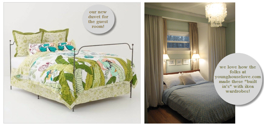
We bought this duvet at Anthropologie and fell in love with it's whimsy "vacation" vibe! This room-shape is very similar to the master bedroom over at the Young House Love blog. We have the same exact ikea wardrobes they used to create this relaxing oasis, and think they had a stellar plan with utilizing the function and creating a really easy breezy design. Our guest room will not be as "spa/ocean influence", but the layout will be similar as far as the designated bed area goes. 

This weekend, progress will be ours! We will keep you posted with photos. In the meantime we are still contemplating how to best utilize the rest of the room. What have you done in your guest room? Do you have photos to share? We would love to have a sneak peak! Share with us! Comment below with links or send photos to joeyandlana@gmail.com!

Monday
Jul122010

Four Rooms, One Goal

I am going to vent for a second. I love a white room. It seems most people do, in fact. I want an all white kitchen for example. However, all I see is people with white houses, room after room. I am getting a little freaked out. Are Joey and I the only people who think the "all-white-thing" is a little creepy/sterile? Looking at pretty pictures in one thing, but after viewing homes in person with all white, everything, I feel like it's missing something, like warmth, they homey feel, ....color. Design is a funny thing, and we all have our own thoughts on how a space makes us feel. No one is right, and no one is wrong, hence I believe it's art. It is what it is, at the end of the day. If you feel good in your room, then you did the right thing.

We feel crazed in most of the rooms in our home. They aren't dirty or cluttered. They aren't too small or mismatched. They are empty. This makes us stir crazy. There is a lot of stuff out there that is easy to knock, but there is also an abundance of beauty to get inspired from. This is where we get stuck. What kind of people are we? What makes us feel good? What makes our house a home?

We would love to know what room in your house you feel best in? Does it compliment your personality? Have people told you "that room is so you!"?

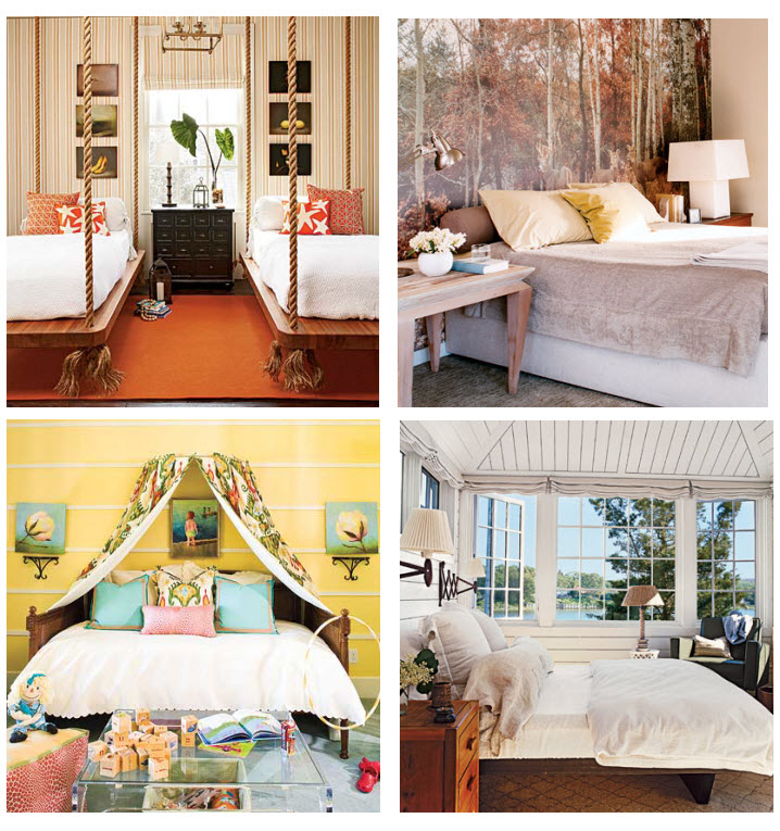
We have collected some photos that represent us. They are of bedrooms, as that's our major Summer goal: complete a relaxing room we feel good in. After putting the photos side by side, we noticed conflict.

photo credits: 1. Coastal Living 2. Cottage Living 2. Southern Living 4. Cottage Living


Room #1: As a married couple, we share a bed. I presume most married couples do. So this double bed is not an option, however the hanging bed is roll-on-the-floor amazing. It's clean and airy, cool and modern. Not to mention fun. We nixed this from our list of possibilities, because it isn't practical. It makes a wonderful option for a guestroom, and it's still in the back of our heads to do someday. 

Room #2: There isn't much we are drooling over, besides the 70's-ish mural of the forest. This would be an awesome white room (I know, I know), with the mural, in a room with a ton of windows. We can see doing this with a faux white deer head as the center of attention over the bed.This room inspired us, in the woodsy relaxed kind of way.

Room #3: It's no shocker a kids room brought us to our knees. The fabric can absolutely be used in an adults room, as well as the crown. The bed just looks like it wants to be jumped into. Being we want a king bed, this style isn't going to work for us, but the crown idea wasn't taken in vein. We have some ideas brewing. The textiles and color are surely somethign worth thinking about for the garden room

Room#4: Windows. Wall. Floor. We love the clean natural combo. Wood and white is no fail, no matter what style it's represented in.


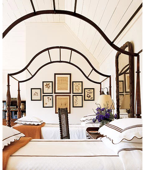
After combining the things we liked about these inspiration rooms, we found a single room which represents them all. And with that, we have been inspired to move forward with the bedroom!

Photo Credit: Southern Accent